A New Layout for the T.LY App
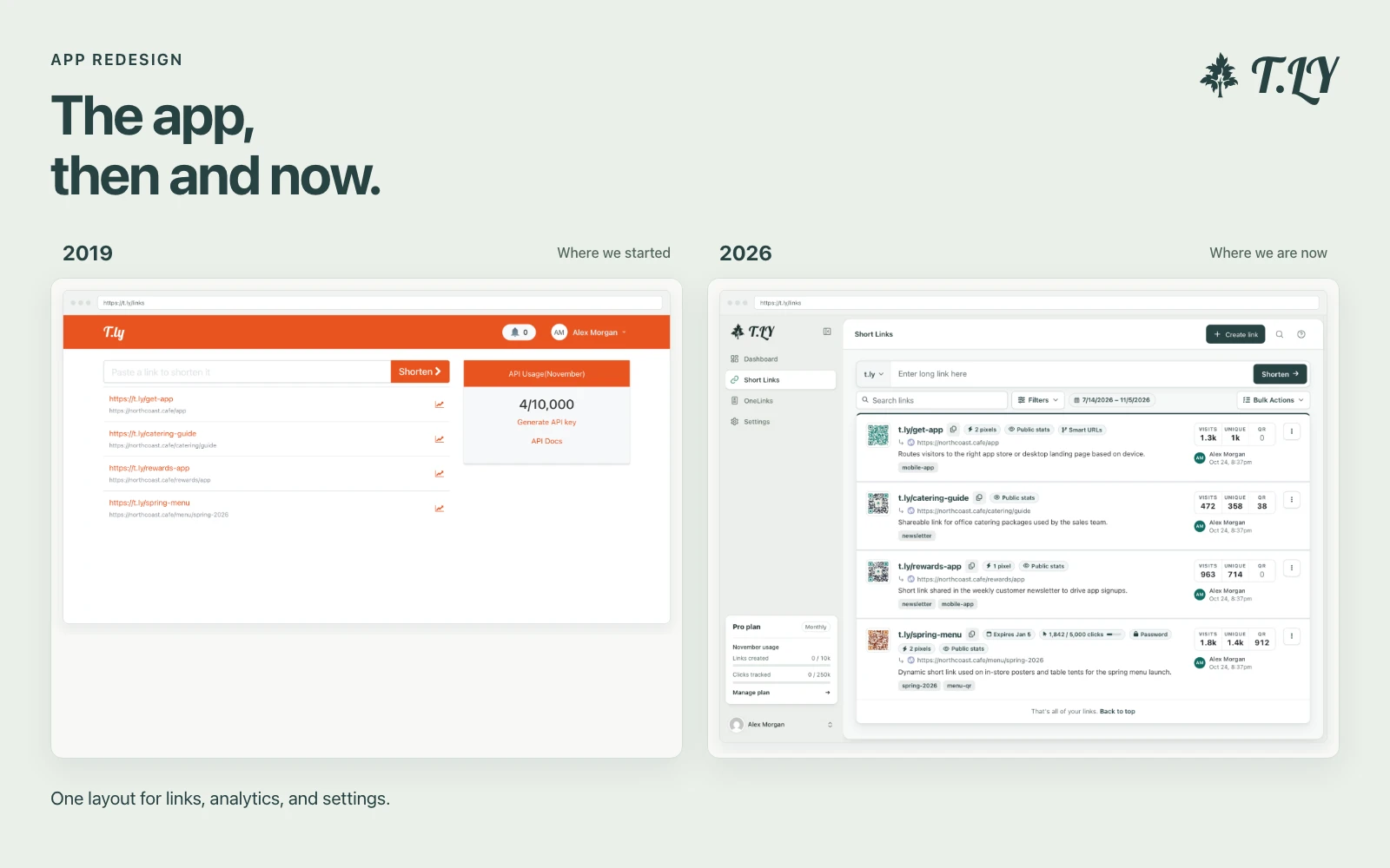
We’ve redesigned the layout across the T.LY app. The dashboard, Short Links, OneLinks, link analytics, and Settings now share one sidebar and header.
If you’re used to the old layout, here’s where to look:
- Main navigation: in the sidebar, with an option to collapse it.
- Plan and monthly usage: near the bottom of the sidebar.
- Account and team switching: in the menu at the bottom.
- Settings: a grouped menu for your account, links, integrations, and team.
- On your phone: the menu button in the header opens navigation.
How the design changed
2019: A form and a link list
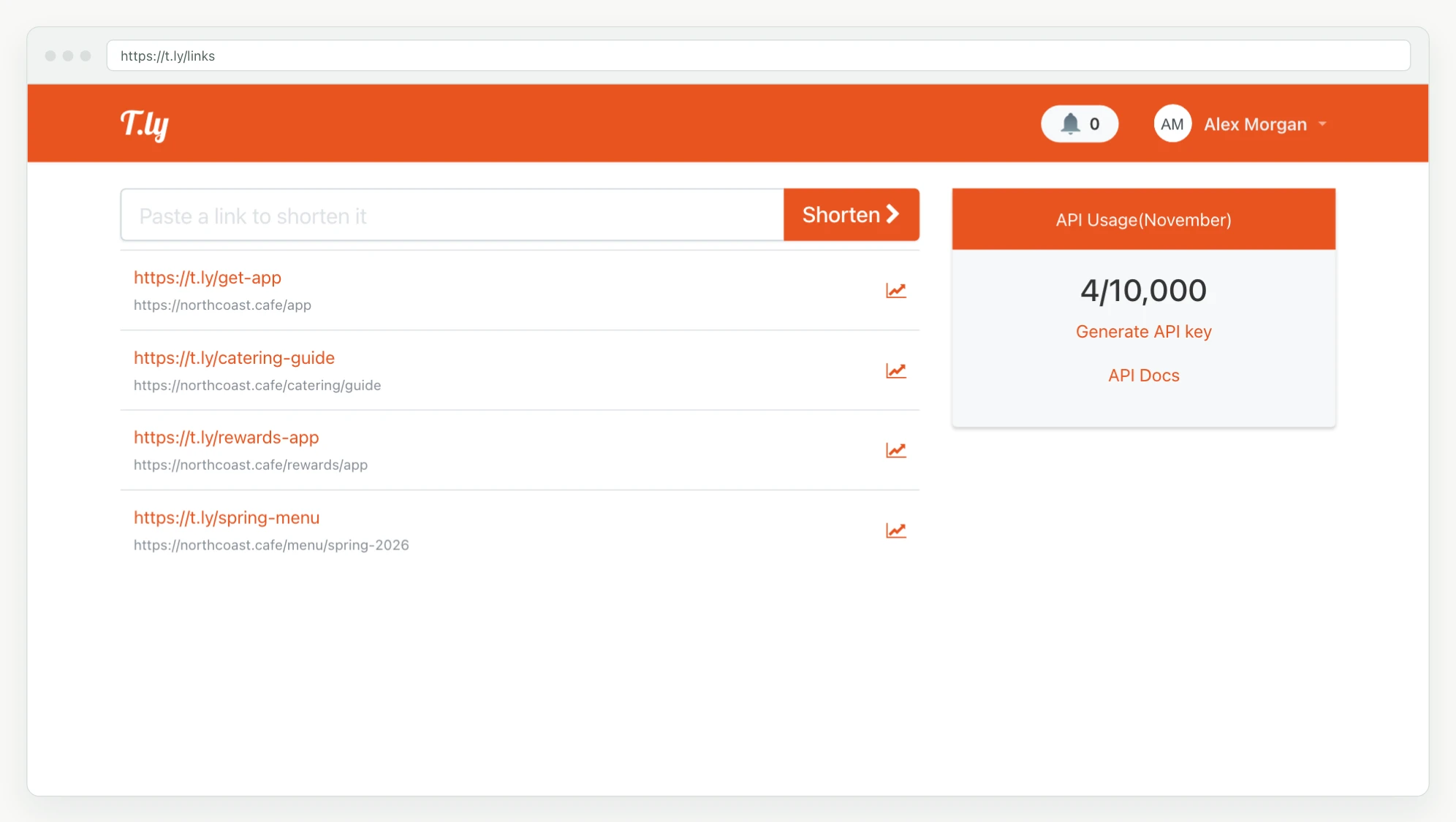
In the 2019 layout, the app was mostly a form for shortening a URL, a list of links, and an API usage card. That was enough for the job it had then.
2021: A fuller Links page
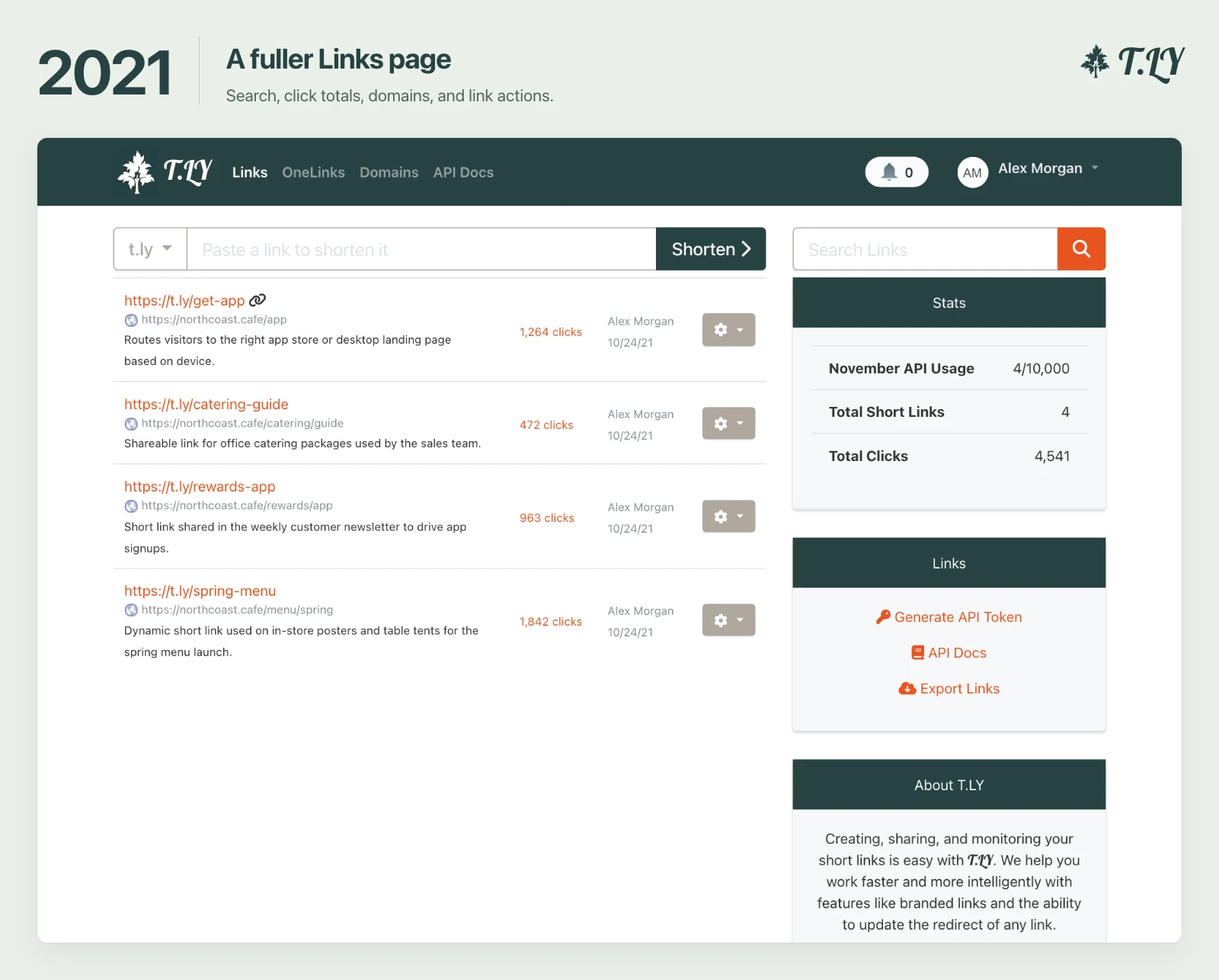
By 2021, the Links page had a domain selector, search, click totals, creator details, and a menu of actions for each link. OneLinks and Domains had places in the top navigation. A separate column held account totals and API tools.
2024: The first team dashboard
In January 2024, we added a dashboard for the whole team. Visits, unique visits, QR scans, the most active links, and a daily traffic chart had their own screen. Analytics was becoming a bigger part of the app.
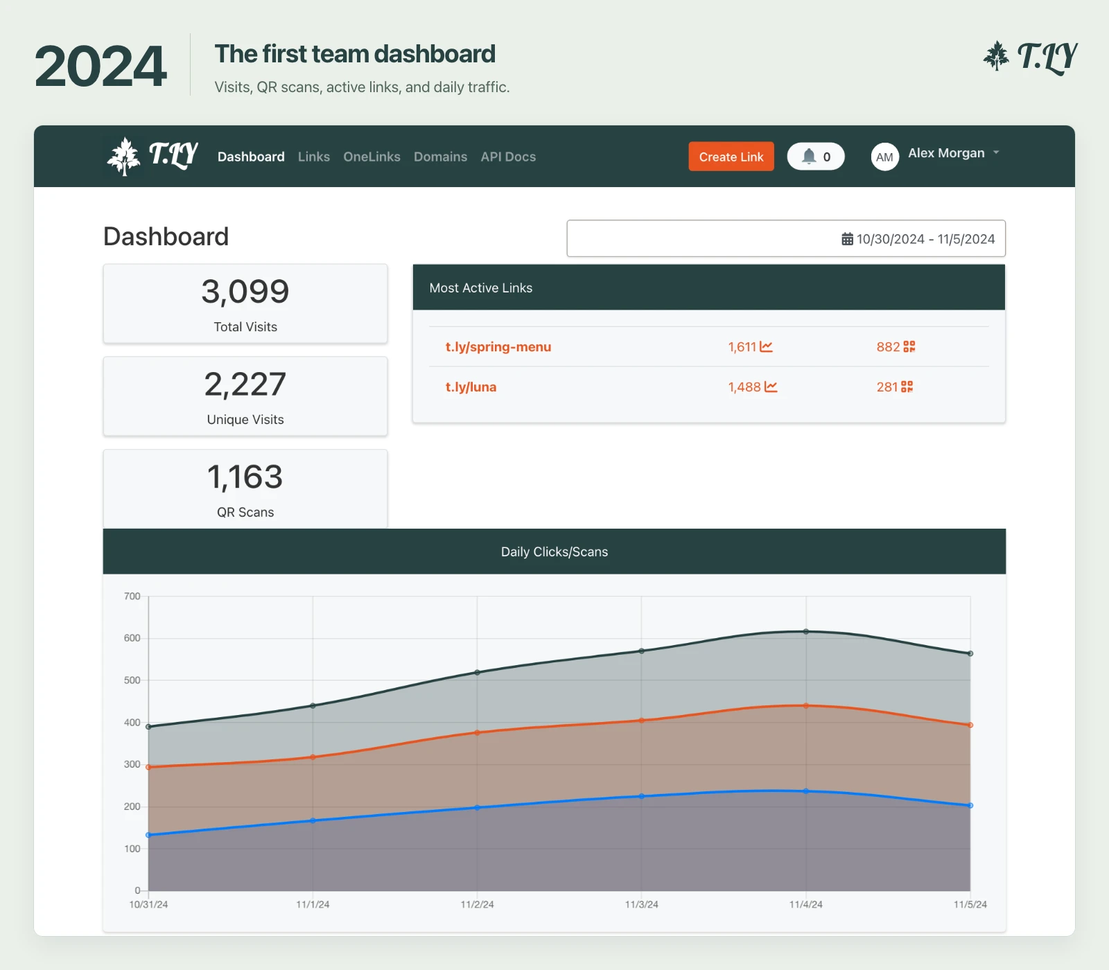
The navigation stayed across the top as the app grew. The latest redesign gives those tools room to grow without adding more items to that bar.
2026: A sidebar across the app
Dashboard, Short Links, OneLinks, and Settings now live in the sidebar. The active section stays highlighted so you can see where you are.
On the dashboard, Visits & Scans and Team activity appear beneath Dashboard in the sidebar. When you open a link report or edit a OneLink, the header shows the parent section so it’s easier to get back.
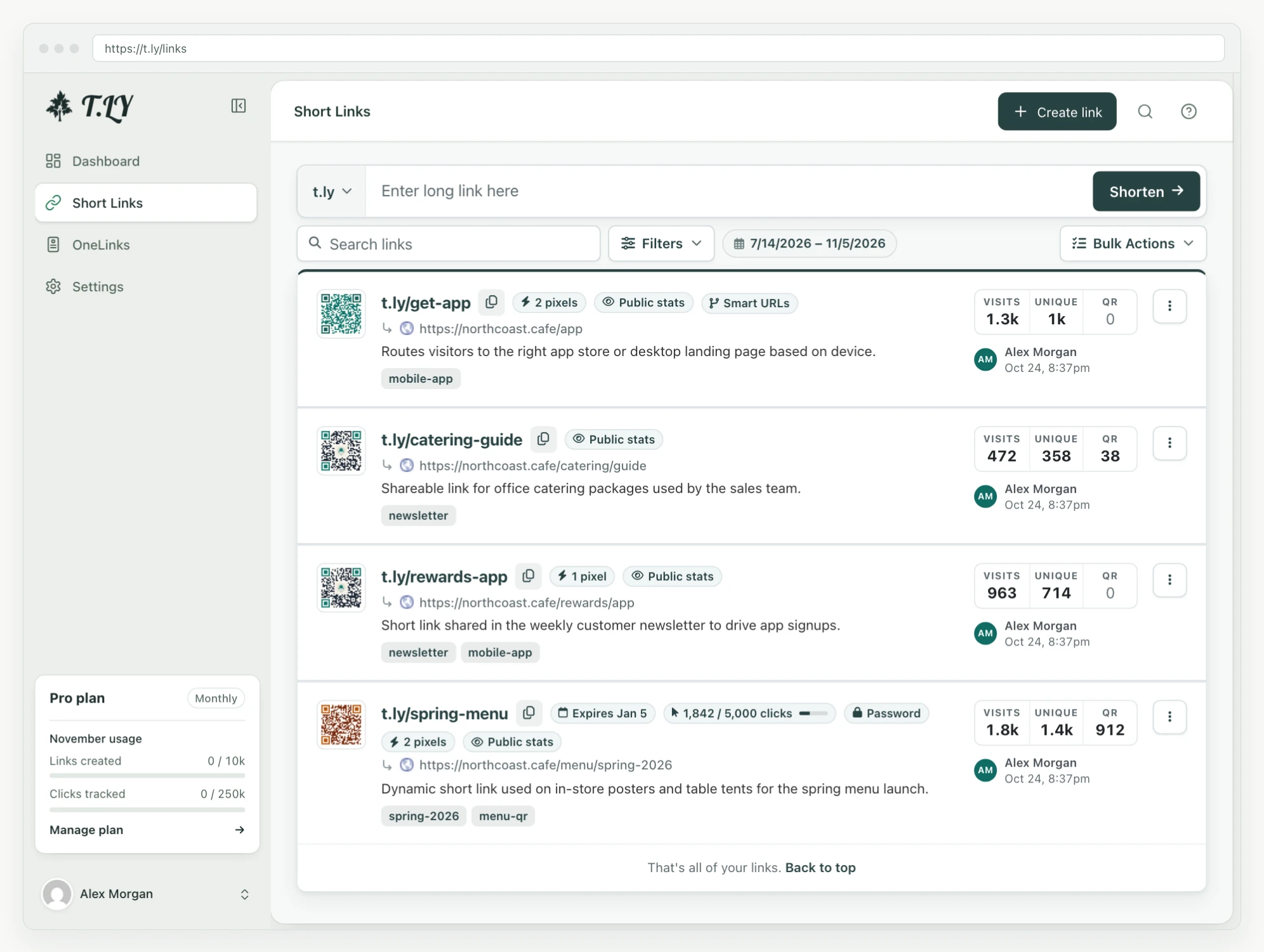
You can collapse the sidebar when you want more room for a report or a long list of links. The icons stay available, and expanding it brings the labels back.
Moving monthly usage out of the separate column beside your links leaves more width for destinations, tags, QR codes, and visit totals.
Create a link or find what you need
When your account is eligible to create links, Create link stays in the header across app pages. If you’re checking analytics and need a new campaign link, you can start it there.
The search button in the header opens a shared search. You can also use ⌘K on a Mac or Ctrl+K on Windows and Linux. Search finds app pages, help articles, free tools, and blog posts. To find one of your short links, use the link-search shortcut inside the same dialog.
For example, searching for “UTM” gives you a way to find the builder or read the setup guide without leaving the app to hunt through the website.
Settings you can scan
Opening Settings changes the sidebar into a menu grouped around the work: account details, link settings, integrations, billing, and team settings. The options you see depend on your account and team permissions.
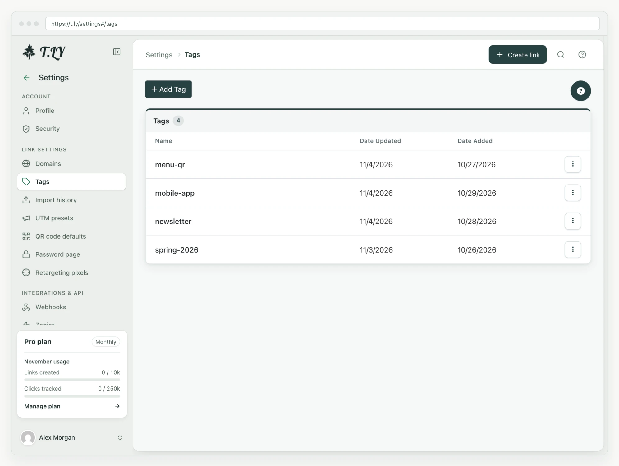
Domains, tags, UTM presets, QR code defaults, and password pages sit together under Link settings. Webhooks and API tokens are under Integrations & API. The back arrow beside Settings returns you to your links.
The dashboard in the new layout
The dashboard brings the overview, traffic chart, and recent visits into the new layout. Period comparisons and traffic insights arrived in our earlier analytics updates; this redesign carries that work into the shared navigation.
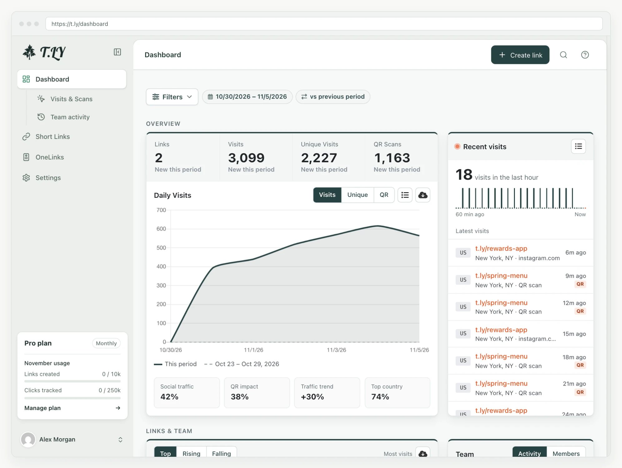
You can read more about those reports in the analytics guide.
Navigation on your phone
On smaller screens, the sidebar becomes a drawer. Open the menu in the header to switch sections, then close it to return to your work. The page gets the full screen while you’re using it.

Open your T.LY workspace to try the new layout.
Related Posts




Tim Leland
Useful Tools
Ready to improve how you manage links?
T.LY URL Shortener makes long links look cleaner and easier to share! Add your own Custom Domains to personalize your brand. Create Smart Links to customize a URL's destination. Generate QR codes to promote your business.
Start your 5-day trial Browser Extension